Wood in context.
Stemming from our philosophy for dealing with wood as a rich material, a graphic design language is starting to unfold that not only looks good, but also interrelates with our core values. This new facet of our visual identity not only welcomes visitors to our website with a delicate animation, but will also be applied on a wide variety of media from our brand in the near future.
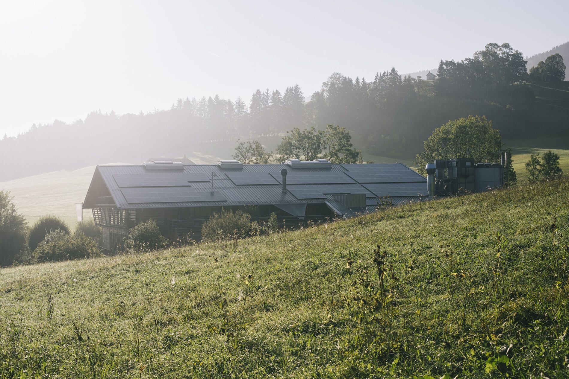
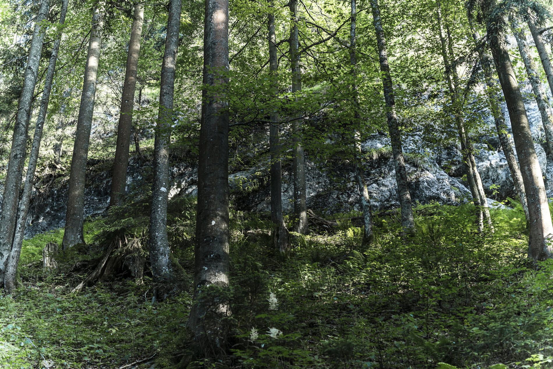
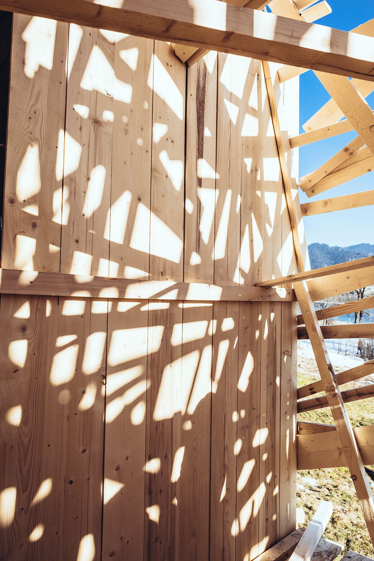
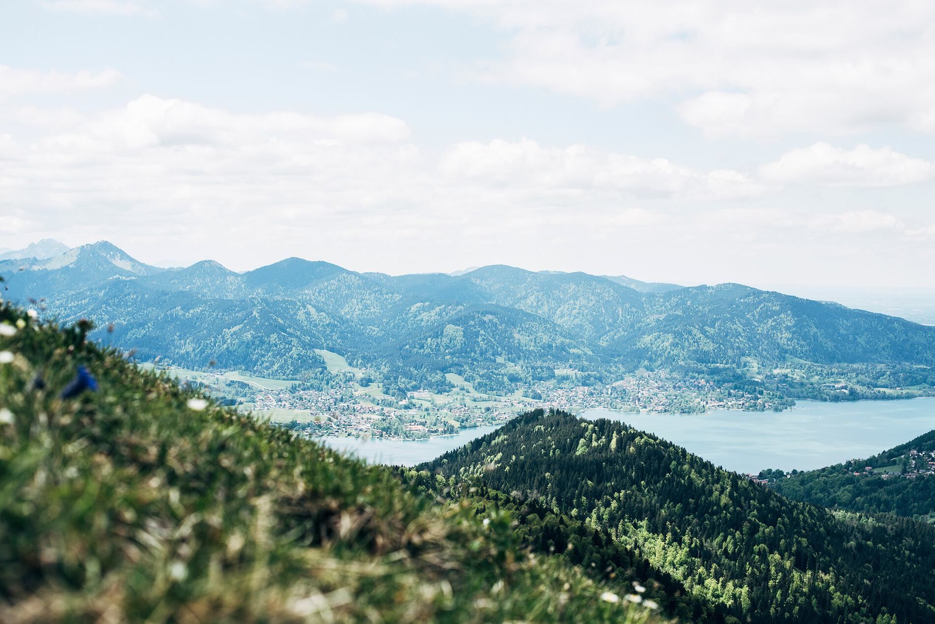
The chosen color palette of the animation reflects the nature of the surrounding Bavarian region, as it surrounds our main location in Eckart with its forests, pastures and rivers. The gentle fading of colours, inspired by wind, waves and the natural play of light shows how the nature around us is constantly changing. Like when the sun falls through the canopy of a forest walk and throws a constantly changing pattern of different shades on the forests soil.
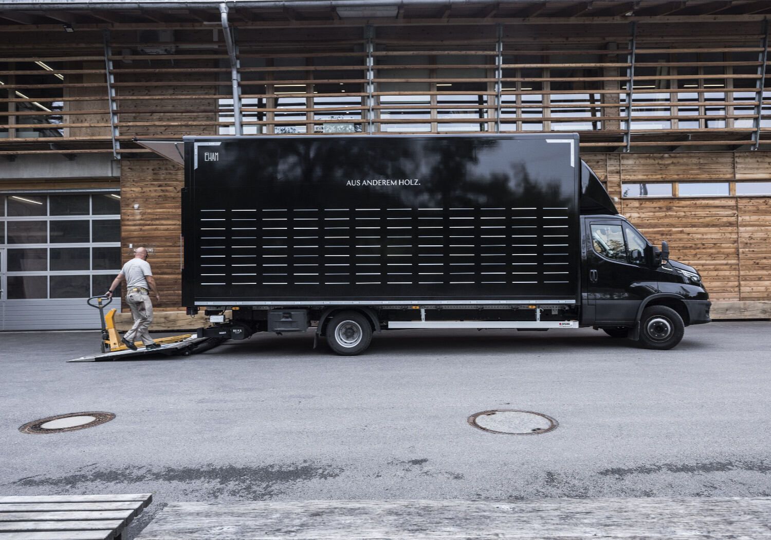
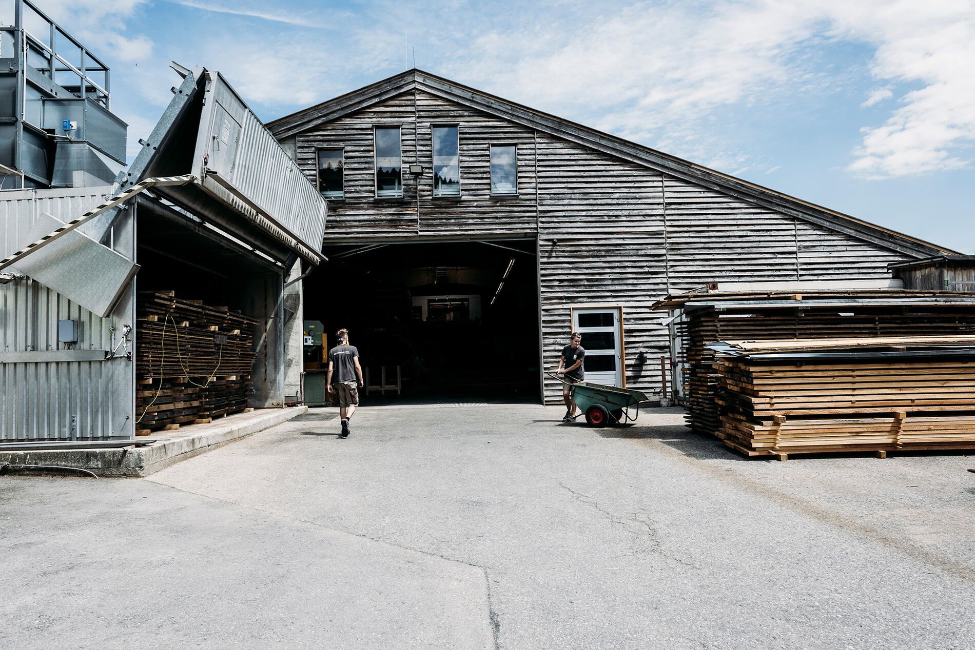
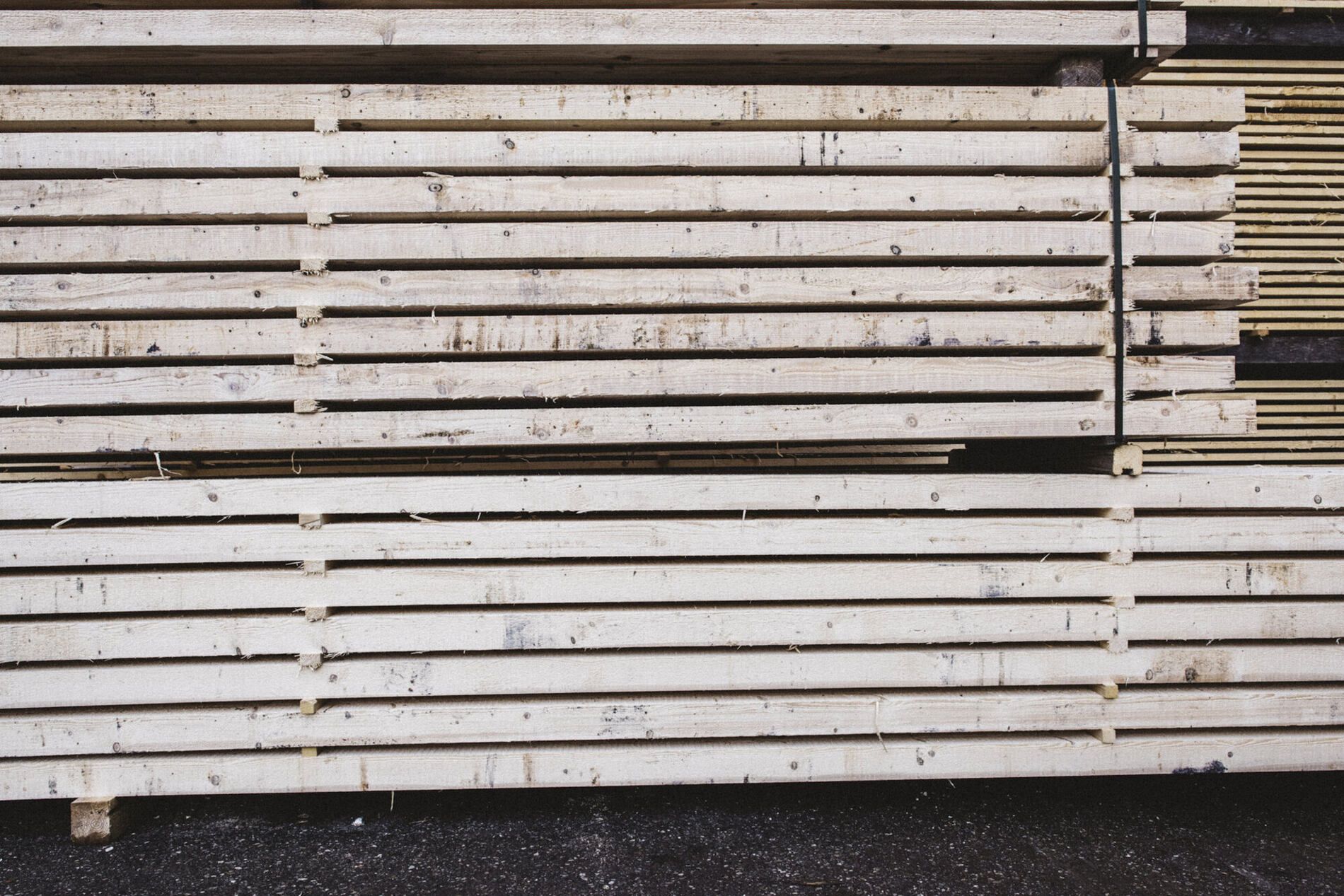
The horizontal lines of the design are also deliberately not oriented upright against their environment, but flow with it in a horizontal movement at eye level. Our processing of the material is also expressed here: this creates associations with the stacking of the wooden planks in our workshop, the boards cut from a tree, which a fellow may be working on with his plane at precisely this moment.
But we also see parts of the facade and the interior reflected here: the shingling of the walls, the pattern of the laid floor. In the strict formal arrangement, our validity for precision comes into play, the floor plans of choreographed spatial connections, the conscious combination of surfaces and bodies. It is our philosophy that to make usable what nature offers us. For ideal living concepts, for a homely feeling.
August 2020
